After logging in, you'll be able to save your favorite works of art in this section. Read more about “My Collection” in the “Project” section.
 
Push slider to the right
Registration successful.
Username already exists!
Passwords do not match!
Slider error
You are almost done. To activate your account, please click the link in the activation email which has been sent to your email address ( )
A new password has been sent.
The informational signifiance of labels
During Tara's first decade of operations, the Bureau created 18,000 consumer packaging projects, five hundred trademarks, one hundred posters, and prepared 1,890 publications for print. These figures could be doubled for the Bureau's entire existence, from 1964 to 1991, and in some instances even tripled – but quantity was not the most essential consideration.
 
The quality of design projects produced at the Bureau and the professionalism of its artists is perhaps best judged by the modernity of their artistic language, the long list of exhibitions and awards won at biennial shows in Krakow, Warsaw, or Brno, by publications in the local press and such specialized trade publications as Dekorativnoe iskusstvo SSSR, Tekhnicheskaya estetika, or simply by the sincere reviews written by consumers themselves. Industry professionals reserved particular praise for brand designs and posters produced by the Bureau, but an equal amount of creativity was also needed to design new labels, advertising brochures and boxes.
 
We might begin with the smallest examples of graphic design projects – labels. Labels were very regularly redesigned or updated, or reprinted after supplies of one series had been exhausted, changing paper types, formats, typefaces, or colors. In 1970, companies overseen by six different ministries and agencies were responsible for label production in Lithuania. Tens of thousands of labels were produced over the course of several decades. Each new draft label design had to be approved at meetings of the Bureau's Arts Council, but the surviving examples of label designs varied in artistic quality and names were often reused, so that it is not always easy to establish authorship or dates of creation.
 
When artists of the Tara Bureau entered the label field in the mid-1960s, however, label designs became noticeably more professional – more bright and colorful, with better coordinated colors, more variation in composition, and the use of more modern typefaces. At the initiative of its designers, the Bureau began producing thematic label series with more unified styles displaying the creative styles of a given designer.
 
A label's artistic choice must not only advertise, it must also inform. Birutė Matijošaitytė, „Unifikuota vaisių-uogų ir daržovių konservų etikečių sistema“, in: Tara. Reklama, 1968, Vilnius: Eksperimentinis taros ir įpakavimo konstravimo biuras, p. 15.
 
Such was the message carried by the Bureau's trade journal, Tara. Reklama, in 1968. If we analyze examples of Lithuanian beverage designs in the 1960s and 1970s, we can better see the informational role played by labeling. One quick glance at beverage labels reveals a recurring theme of naming products with Lithuanian place names from nature, cities, resorts, lakes, and rivers: Palanga liqueur, Puntukas sparkling wine (named for a landmark boulder in north central Lithuania), Rubikiai berry wine, Žuvintas flavored wine, Nemunas Lithuanian gin (after the country's longest river), or Anyščių šilelis mead, named after a famous Lithuanian poem. The brands emerged as references to, or echoes of, ethnographic expeditions that become part of Lithuanian history and local traditions of environmental and ethnographic research.
 
Label concepts changed and adapted to bottle designs, which were also being updated in the 1960s to create original approaches and shapes for each beverage type. Custom-designed and limited-edition packaging was introduced so that companies could showcase their product lines. A stand out in this effort was the Stakliškės factory, famous for its Lithuanian mead recipes and souvenir packaging designs. Advertising texts and visual representations of these beverages emphasized a link to Lithuanian antiquity, glorified ancestral military campaigns (using product names such as "Bočiai" – Ancestors, "Pilėnai" – the site of a famous battle against the Teutonic Order, or "Žalgiris" – the Lithuanian name for the 1410 Battle of Grunwald), historic Lithuanian sites (Prienų šilai - the Forests of Prienai) and place names (Dainava).
 
Another wonderful example of labels performing an educational role was an eight-label series produced for Anykščiai Wines featuring historic imagery of Lithuanian cities, castles, and estates. Romualdas Svaškevičius, a Tara designer given the commission to design a showcase series of labels for natural Lithuanian wines, recalls the engravings depicting historic Lithuanian cities, manor houses, and castles that he selected for the different beverages. On the label for the Anykščiai Cherry Wine, for example, we see a gold framed lithograph of Napoleon Orda's 19th century Biržai Castle; on the Apple Wine – an image of the Radvila (Radziwiłł) family manor in Kėdainiai; and on the Mountain Ash Berry Wine, Tomasz Makowski's depiction of the city and castle of Trakai in the 17th century.
 
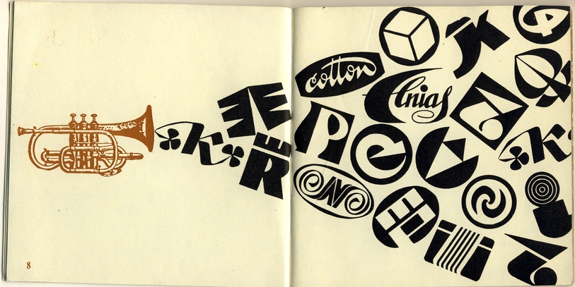
The modernization of label artistry was often determined by changes in typefaces and brand designs. While the 1950s saw the predominant use of inscriptions incorporating folk art motifs and ornamentation, artists in the 1960s sought to create unique fonts for each beverage to better reflect its type and name to shape a recognizable composition. This trend was well illustrated by Vladas Lisaitis' label designs for "Piliakalnis" (Castle Mound), and Kostas Katkus' labels for such beverages as "Pipirinė" (Pepper Brandy), "Medžiotojų karčioji" (Hunters' Bitters) and "Anykšta".
Package design: from folk art illustrations to modern decoration
Given the Bureau's initial official title – the Experimental Package Design Bureau – and its short-hand name, "Tara" (Container), it's evident that packaging design was meant to be one of the agency's principle missions. Indeed, the proposal to establish the Bureau called for the:
 
Exploration, research, testing, and introduction of new materials, first and foremost various types of paper, cardboard, and polymer sheeting for packaging and container production. 1964 05 14 d. pasiūlymai dėl Liaudies ūkio tarybos Bandomojo taros ir įpakavimo konstravimo biuro įsteigimo, LCVA, f. R-239, ap. 4, b. 140, l. 235–237.
 
Bureau designers created original packaging designs from paper, glass, metal, and plastic for all kinds of different products: from food tins to souvenir items. Some design proposals never made it past the sample stage, as evidenced by a request inscribed in a comment book by a visitor to a graphic design show:
 
It would be wonderful if such beautiful candy boxes could actually be found in stores, not just in exhibitions. 1967 m. pirmosios pramoninės grafikos parodos lankytojų atsiliepimai, LCVA, f. R-396, ap. 4, b. 24.
 
Designs for confectionary items, specifically candy and chocolate boxes, were among the products that received the most attention from clients and consumers alike. The names of some of the Bureau's artists-constructors who created these designs are worth mentioning here (even while many others were never made public). Confectionary product design specialists included Teresė Bajorūnaitė, Vaidilutė Grušeckaitė, Teresė Ivanauskaitė, Jadvyga Laurinavičiūtė, Astrida Žilinskaitė, and Monika Urmanavičiūtė. The confectionary packaging they designed revealed several trends in graphic design of the 1960s, of which the most prominent was the use of folklore motifs – a common feature found throughout all Lithuanian graphic design of this period. Folklore was embraced in graphic design examples both as a thematic subject and in a fluid language of design elements, ranging from the use of folk art illustrations to modern decoration.
 
If we look at the names given to confectionary goods in the 1960s, we notice a predominance of folklore narratives and references. Examples included "Vai kur buvai" ("Where were you", a line from a well-known folk song), "Vaiva" (a shortened version of the Lithuanian word for "rainbow", in a design by Elena Lisauskienė), "Suk suk ratelį" (borrowed from a popular folk song and dance for a product by Jadvyga Laurinavičiūtė), "Žvaigždutės“ (Little Stars, a design by Monika Urmanavičiūtė), and "Dūda" (a traditional Lithuanian folk horn, for a design by Laimutė Ramonienė).
 
Several designers created chocolate box concepts based on their own interpretations of the beloved Lithuanian fairy tale Eglė žalčių karalienė (Eglė, Queen of the Serpents), one of the most popular narratives to emerge in graphic design in Lithuania in the 1960s. Teresė Bajorūnaitė used this theme in several of her packaging designs, creating compositions of decorative ornaments and motifs engraved with folklore elements such as fir trees (from the equivalent Lithuanian word, and common woman's name, "Eglė"), the sun, stars, a serpent's crown. Another design project which showcased Bajorūnaitė's unique style was the "Kaukė" (Mask) chocolate candy box. The front of the square box included a sketch reminiscent of a Carnival or Shrove Tuesday mask, imitating the patterns and decorative etchings commonly found in Lithuanian folk clay works.
 
Jadvyga Laurinavičiūtė, meanwhile, adapted the characteristic style and ornamentation of traditional Lithuanian Easter egg designs and wooden chests for her designs of the "Paukščių pienas" (Birds' milk) chocolate candy line: a rectangular box with a white drop of milk incorporating the logo of the Karolis Požėla confectionary factory, designed by Svaškevičius.
 
Another Laurinavičiūtė design, packaging for "Bočių likeris", was considered a collector's item for its distinctive engraved printing and gold color accents. The front of the square packaging depicts a photographed image of a chocolate candy in the shape of a horn, alongside which the designer incorporated a playful placement of the factory logo and a product name in an angular typeface, meant to symbolize the fortitude of Lithuania's ancestors ("bočiai"), surrounded in stylized recreations of traditional folk spindle ornamentation.
 
Vaidilutė Grušeckaitė's confectionary packaging designs were also known for meticulous photographic detail and a minimalist approach. One of her first designs arranged a display of "Asorti" candies and a lower case "a". In her design for the Giliukas candy line produced at the Rūta confectionary factory, Grušeckaitė chose to use a placard style approach, incorporating traditional folk art cutting ornamentation and diagonally placed inscriptions.
 
The trend toward the use of moden decoration is well illustrated in the design of the Nida chocolate box by Bureau artist Teresė Ivanauskaitė, who chose a sun and star motif and echoing geometric circles that, as they join together and overlap each other, create a feeling of optical art vibrations and graphic rhythm, accentuated by the golden color used. The rectangular cover of the candy box retained an asymmetric composition emphasized by the caligraphic lettering in the name "Nida" that almost looks like the designer's signature. Ivanauskaitė understandably often called this package design her "calling card."
 
The examples of Lithuanian packaging designs described above illustrate how artists used unique and creative interpretations of folklore themes in their search for new forms of expression. The trend toward modern decorativity in examples of 1960s graphic design reveals itself through a laconic and emotional use of fluid forms that are the product of vivid and contemporary interpretations rather than a simple and direct understanding of folk art.
Flashes of pop, optic and psychedelic art in advertising posters
Posters were among the most ideological fields of art in the Soviet era, subject to strict control by various government institutions. The posters designed and released at Tara more or less corresponded to the Bureau's field of specialization, consisting of different types of informational, instructional, and advertising posters. Speaking in 1968 about prospects for advertising posters, Antanas Gedminas lamented that it was a "forgotten" and underutilized field:
 
Our salesmen view this from a purely commercial perspective: if a product sells, why bother advertising it? The other functions of posters are completely overlooked. As a kind of chronicle, posters should also record our industrial achievements and inspire patriotic pride, as if to say: Look, we've created the first refrigerator, the first television set, the most precise cutting lathe Antanas Gedminas, „Plakatas – tai vaizdinė agitacija“, Literatūra ir menas, 1968 01 06, p. 4.
 
Indeed, the views of many in the sales force were often shaped by the indifference and bureaucratic obstacles plaguing the Soviet system, and by a general lack of competition and the priorities of fulfilling economic plans. Another telling quote from this period can be found in a 1971 article with the rhetorical headline: "Do we need advertising?":
 
It's just a fact that, upon hearing the word "advertisement", many just smile and shrug, as if to say - why bother? Just produce more goods and products will sell without any need for advertising. Arūnas Gedžius, „Reikia mums reklamos?“, Mokslas ir technika, 1971, Nr. 1, p. 12.
 
With such prevailing attitudes, most compelling advertisements designed at the Bureau were never released, though print runs of some posters did reach into the tens of thousands. Interestingly, advertising posters of the 1960s were exactly where one could see elements of modern and plastic expression – flashes from pop to psychedelic art. Psychedelic artPsychedelic art was an alternative art and design movement that emerged in the social unrest of mid-1960s America and was usually associated with rock music and the colorful hippie culture. Psychedelic design examples included concert posters, music albums, and magazine covers with distinctive bright colors and curved font styles. The style was meant to reflect the trance-like mood produced by psychotropic drugs like LSD. Leading names in the psychedelic art movement included Wes Wilson, Victor Moscoso, and Peter Max.
 
The language of pop art is inextricably linked to experiments in photography and collage art that greatly expanded the boundaries of graphic design's expressiveness. Kęstutis Gvalda's 1968 poster for the Silva factory's knitwear products depicts them as colorful, durable, and stylish. The poster's mood is shaped by bright colors, a rhythm of symmetry and asymmetry, and the playful incorporation of a girl's image alongside the factory's logo.
 
In another poster produced at the Tara agency, however, we see no logo or brand at all, since the purpose of the advertisement is not the promotion of any particular company's product, but milk in general – "the secret to youth and beauty". Commissioned in 1970 to promote dairy products, Kęstutis Šveikauskas employed collage elements and youthful colors to create one of the most memorable female portraits in 1960s Lithuanian graphic design.
 
Teresė Bajorūnaitė portrayed completely different characters in her advertising posters, basing her work on Lithuanian folk tales. In one example, she adapted text from one story for a production line of Anykščiai Wines in 1966 ("Vai, kas išrašė veidelius tavo…" - O, who bedecked your face), and another line from a famous folk poem ("Vilniuj buvau, bobut mano…" – I was in Vilnius, my dear old woman) for a series of confectionary items produced at the Pergalė factory in 1968. Both posters depicted people dressed in folk costumes, carting away to the village new purchases bought in the capital. Though neither of these two designs was ever printed, the advertising element in each was emphasized through a unique incorporation of newly designed Lithuanian corporate logos and a meticulous reproduction of product samples.
 
Psychedelic art influences reached the Soviet Union in the late 1960s together with rock music and hippie culture. Echoes of the style emerged in Lithuanian graphic design through shimmering bright color combinations and glowing typefaces. Kęstutis Gvalda's 1969 "Aplankykime Palangą" (Visit Palanga) poster accented an undulating hand-painted inscription inviting tourists to the Lithuanian seaside resort. Above it, a subtly placed paper collage detail portrayed a flag flying in the coastal winds above the landmark Palanga pier.
 
In another advertising poster, Gvalda deploys the playful brilliant flashes of optical art that Lithuanian photographers and graphic artists working with both sheet and book graphics discovered in the 1960s. Graphic artist Vytautas Kaušinis became the best known master of op art posters, as seen in his 1968 promotional poster for an industrial aesthetics exhibition.
 
The shimmering linear rhythms were particularly well suited for the musically themed posters created in the late 1960s by Vytautas Kaušinis, Jonas Gudmonas, and Juozas Galkus. Galkus shared his recollections on the op art trend of the era:
 
At the time, we were all enamored with the interplay of sharp, orderly geometric shapes that agitated the eyes and surprised viewers with unexpected movement. In a hermetically sealed society, it was difficult to find information about the op art trend sweeping the world or about its star Victor Vasarely, but snippets would slip through in the Polish or Czech press. Juozas Galkus: plakatas, tapyba, heraldika, sudarytoja Ingrida Korsakaitė, Vilnius: Vilniaus dailės akademijos leidykla, 2005, p. 43.
 
Gvalda also turned to op art's artistic language for a commission from the Panevėžys electrical engineering factory. After precisely calculating his design dimensions, Gvalda then sketched in a series of gradually shrinking black circles to create the illusion of a light source. He then completed the design by adding a main advertising slogan in a sans serif font similar to the Univers typeface: "Our lamps for our homes. Stylish, convenient, beautiful."
 
Gvalda didn't try to illustrate or otherwise showcase the lamps produced by the factory, and instead created a modern composition that reflected the product line in its own unique way. The result as a wonderful example of graphic design or "abstract advertising" in which an artist or a poster or product designer seeks to communicate with the viewer. The client or advertised product or service plays a less prominent role.
 
Such artistic graphic design trends were evident in the history of Western graphic design in the 1950s and 1960s, such as the creations of Paul Rand and the New Advertising New AdvertisingNew Advertising was a graphic design movement in the United States in the 1950s and 1960s inspired by designer Paul Rand (1914–1996) who employed numerous modern art techniques and references to create now famous logos for corporations such as IBM, UPS, ABC, NeXt, among others. Changes impacting US advertising in the 1950s were associated with the rise of colored advertising and photography. Designers and art directors overseeing magazines and advertising agencies came to understand that viewers and consumers had to become active players in advertising, contributing to the reading of a given message, and that the advertising message was inseparable from its form. One example of New Advertising was the famous 1959 "Think small" ad for Volkswagen, created by the Doyle Dane Berbach (DDB) agency. with which his work is associated, or the creations of Swiss graphic design The Swiss StyleThe Swiss Style, also known as the International Typographic Style, is a graphic design style emerging in Switzerland in the 1940s and 1950s that became popular worldwide by the 1970s, distinguished by simple, clear composition solutions using a mathematical grid, sans-serif typefaces (usually Helvetica), asymmetric text layouts,  and photo montages. The best known designers of the style were the Swiss artists Richard Paul Lohse, Joseph Müller-Brockmann, Hans Neuburg, and Carlo Vivarelli, who together began publishing the magazine Neue Grafik in Zürich in 1958. Other prominent designers associated with the Swiss Style included Armin Hofmann and Emil Ruder of the Basel School of Design. masters.
 
The international character of Lithuanian trademarks
In the 1960s and 1970s, advertising brochures, packaging, posters, and even the smallest labels designed in Lithuania incorporated new, modern Lithuanian trademarks. Trademarks were one of the graphic design fields in which Experimental Package Design Bureau designers took particular pride, earning them broad recognition and awards.
 
The first issue of the trade magazine Tara. Reklama in 1966 showcased the Bureau's first trademark designs and their creators:
 
These "small" industrial graphic creations needed to perform great tasks. They were the calling card for a product and its manufacturer, the face of an enterprise. Once a manufacturer affixed its trademark to a product, it assumed complete responsibility for its quality and the obligation to only supply consumers with the highest quality products. „Respublikos įmonių prekiniai ženklai“, in: Tara. Reklama, Vilnius: EMKB, 1966, p. 16.
 
While this citation may read like text from a Western graphic design textbook or magazine, within the context of the socialist system it had a bit of a utopian ring. Such aspirations were more reflections of declared government promises than actual attitudes or capabilities of manufacturers.
 
It should be mentioned that artists welcomed trademark commissions, viewing them as an inspirational creative process that allowed them to demonstrate their professionalism and personal style. More than two hundred new trademarks were created in the first six years of the Bureau's existence, from 1964 to 1970. Each new trademark was registered with the Soviet Council of Ministers' Committee for Inventions and Discoveries. The certification process sometimes took several years, since registration was reserved solely for original trademark drafts. Thus, designers had to seek out new, unique, and untried solutions, despite the fact that many similar enterprises and product brands existed throughout the Soviet Union.
 
Bureau designers to this day recall certain laughable requirements. In one example, a commission to create a trademark for a brewery was accompanied by an instruction forbidding the use of images of beer foam, beer mugs, or hops, since they were already present in the branding materials of other enterprises.
 
Designers favored laconic and pure forms in the creation of new trademarks that would ensure effective advertising and brand recognition. The simpler the forms and the fewer extraneous details and information in a given trademark, the easier it was to recognize, reproduce, and use to create an overall brand style.
 
Personal libraries and archives testify to the fact that Lithuanian trademark designers had a thorough knowledge of Western literature and trademark history and oriented their work toward new trends. For example, the personal archives of Teresė Ivanauskaitė include a 1968 issue of the Bureau's trade magazine, Tara. Reklama, which featured the world's most famous graphic design works shown in New York in 1967 at an exhibition of leading trademarks hosted by the American Institute of Graphic Arts. The magazine reprinted 160 works from the exhibition, with accompanying text that emphasized their artistic value: artists sought to create original but also functional and, most importantly, timeless trademarks.
 
In the 1960s and 1970s, designers were not only busy creating new, modern trademarks for newly established factories and enterprises, they were also tasked with "updating" existing marks designed in the inter-war period and in the 1940s and 1950s. Redesigns of trademarks from nationalized pre-war Lithuanian corporations often retained the style of the original brands, as was the case with the textile company "Kauno audiniai", which featured the enterprise's name in calligraphic text (by Kęstutis Ramonas) while preserving the mark's most recognizable details and adding new, stylized and contemporary forms. In another example, revisions to the trademark for the "Cotton" hosiery factory, designed by Laimutė Ramonienė,  reflected the company's speciality and added to its minimalist corporate style revealed in op art packaging and bag designs (designed by Monika Urmanavičiūtė and Raisa Šmuriginaitė)
 
In terms of their visual and semantic expressiveness, level of abstraction and suggestiveness, the trademarks created by the Bureau perfectly blended into the overall global context, even though they often represented small and peripheral Soviet enterprises. The Lithuanian character of these designs was most evident in trademarks centered around text and typeface featuring readily recognizable Lithuanian words, letters, unexpected formations, and expressive combinations.
 
Only a few trademarks created in the 1960s have "survived" to this day, due to changes in fashion, corporate names, ownership, and the products manufactured. Some examples of "timeless" Lithuanian graphic designs include: the "Vilniaus duona" (Vilnius Bread) logo, created by Teresė Bajorūnaitė in 1967, Romualdas Švaškevičius' trademarks for Anykščiai Wines, logos designed by Kęstutis Gvalda for the Kapsukas milk cannery, now incorporated into the logo of the Marijampolė cannery, and Raisa Šmuriginaitė's trademark for the Panevėžys dairy factory, still featured today on "Pieno žvaigždės" waffle ice cream cups.

Comments

Write a comment
No comments.

Sources and links

1964 05 14 d. pasiūlymai dėl Liaudies ūkio tarybos Bandomojo taros ir įpakavimo konstravimo biuro įsteigimo
Lietuvos centrinis valstybės archyvas, f. R-239, ap. 4, b. 140, l. 235–237
1967 m. pirmosios pramoninės grafikos parodos lankytojų atsiliepimai
Lietuvos centrinis valstybės archyvas, f. R-396, ap. 4, b. 24
Juozas Galkus: plakatas, tapyba, heraldika
Sudarytoja Ingrida Korsakaitė, Vilnius: Vilniaus dailės akademijos leidykla, 2005
Tara. Reklama
Informacinis rinkinys, Vilnius: EMKB, 1966
Tara. Reklama
Informacinis rinkinys, Vilnius: ETĮKB, 1968
ANTANAS GEDMINAS
„Plakatas – tai vaizdinė agitacija“
Literatūra ir menas, 1968 01 06
ARŪNAS GEDŽIUS
„Reikia mums reklamos?“
Mokslas ir technika, 1971, Nr. 1
Loading…
[[item.title]]
[[item.description]] [[item.details]]
You have subscribed successfully.
Patikrinkite savo pašto dėžutę ir paspauskite nat gautos nuorods norėdami patvirtinti užsakymą.